During the creation of my A2 media studies production, I have used a variety of media technologies for a range of aspect pertaining to my project which is a Teaser Trailer for a horror film with an urban/hood background called Ghosted which is a slang term for missing which was our original name for our film but was changed due to us finding a film already called "The Missing".
The first form of technology that I have to mention would have to be the most basic and easiest to use which is Television; as soon as it was decided between me and my partners that we were going to create an trailer, it became a habit of mine to examine and analyse conventions of any trailer that came before me when watching television which was unlike me before where I would change over the channel when I saw that the show was going on a commercial brake. Another form of media technology that was vital and more useful than watching T.V would have to be video sharing websites that I gained access to via the Internet in particular www.youtube.com, the reason that I found this site to be more useful to me in analysing teaser trailers than television is that unlike T.V where you can only watch trailers that the broadcasters decide to play rather than ones you wish to see, on YouTube you could just input the name of the teaser trailer of a particular film that you wished to watch and it would give you results that can allow you to see trailers by searching online for films of the genre that are similar to yours so you can see their trailers or even trailers that you might not even regularly be able to see on British television, the latter was helpful for me in particular who was making a version of the Ghosted trailer for circulation in the US while my partners were making the UK version of the trailer, if it was not for YouTube I would not have noticed that only American trailers have the green ratings screen.
The first form of technology that I have to mention would have to be the most basic and easiest to use which is Television; as soon as it was decided between me and my partners that we were going to create an trailer, it became a habit of mine to examine and analyse conventions of any trailer that came before me when watching television which was unlike me before where I would change over the channel when I saw that the show was going on a commercial brake. Another form of media technology that was vital and more useful than watching T.V would have to be video sharing websites that I gained access to via the Internet in particular www.youtube.com, the reason that I found this site to be more useful to me in analysing teaser trailers than television is that unlike T.V where you can only watch trailers that the broadcasters decide to play rather than ones you wish to see, on YouTube you could just input the name of the teaser trailer of a particular film that you wished to watch and it would give you results that can allow you to see trailers by searching online for films of the genre that are similar to yours so you can see their trailers or even trailers that you might not even regularly be able to see on British television, the latter was helpful for me in particular who was making a version of the Ghosted trailer for circulation in the US while my partners were making the UK version of the trailer, if it was not for YouTube I would not have noticed that only American trailers have the green ratings screen.
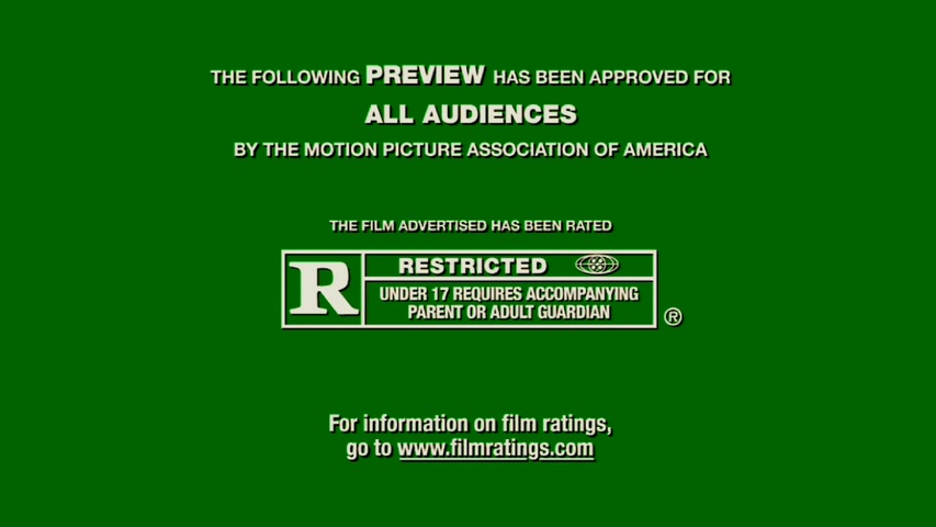
To put my own spin on this convention I used photoshop to create my own original rating "T for Traumatic" to go with the theme of the horror trailer that I am creating.

The forms of visual multimedia such as T.V and the video sharing websites that I used aided me in finding several conventions present in most teaser trailers, for example before I started analysing trailers on T.V & YouTube I had not noticed that it is common for most teaser trailers to have a catchy part in the trailer that is used to draw in viewers so that they will be tempted to come and see the actual film in the cinema e.g. in the Nightmare on Elm St. (2010) Trailer.
The catchy phrases that I caught from this were where one of the victims say "Oh God" which Freddie replies "No, Just me" & when Freddie asks another victim "Why are you screaming?, I haven't even cut you yet". The catchy visual parts of the trailer were the various special effects used like Freddie distorting the wall and the last scene where the doctor's hand turned into Freddie's. For my trailer I recorded a catchy part that was somewhat comedic yet to the plot to counteract all the doom and gloom; the scene entailed 2 gang members running from the killer and hiding in a corner, the camera then those a close up of one of the youths who tells the other while looking out for the killer that if they do not kill their pursuer then they will be killed instead, when he looks back however his friend is running away while saying "every man for himself fam (family)!" however I was unable to use the footage in the final piece because of how long it was. So to get over this problem I enlisted the help of 2 of my friends who train in MMA (Mixed Martial Arts) and they staged a fight scene that I sped up to give a bit of comic relief, when I asked people about it they told me that it was unexpected which was what I was going for, I used my own skills with the camera so that the final punch was cut out of the camera so that the viewer thinks that the youth has been knocked out when in truth the punch didn't even connect.
During the actual project production stages i was in dire need of some sound effects for my trailer. to get around this problem i immersed myself in a variety of media technologies to aid me in audio retrival. To get the sound effect that i noticed were prominent especially in horror films i used www.listentoyoutube.com to get the audio from teaser trailers on youtube, i then proceeded to edit these sounds on a freeware software that i downloaded called WavePad audio editor this allowed me to change the pitched to something that i liked as well as amplify the sound if it was not loud enough, i also use Adobe Audition to record voices to use in the trailer which i saved as Wave files.
 My target audience are young people from urban backgrounds in particular but not exclusive to males because in my view these are the people that would most relate to what is happening in the teaser trailer, if the trailer was to be actually made into a film the plot from the trailer was made to have an underlying message to the viewer somewhat subliminal that when you do bad things karma has a funny way of usually paying you back & based on my research people usually watch these types of films at a young age so this would act somewhat as a deterrent.
When I was carrying out my audience research I used a new type of media technology that I had no prior knowledge about until one of my friends that attends Christ the King 6th College and is also doing Media Studies introduced me to it; it is called www.surveymonkey.com.

Survey monkey is a website that allows you to easily create web based surveys online that you can then distribute via a number of other multimedia social networks; I used Facebook where i have a lot of people are a part of my target demographic, i then proceeded to pester them until they took part in my survey, giving me significant results.


From the feedback that i received, i found out several things about my target audience such as the fact that almost all of them were underage when they watched their first hood movie, this trait was more common however for horror movies. I also discovered that my target audience preferred horror movies more than hood movies.
Unlike my partners who created trailers that included both men and women, my trailer only contained men and was predominantly black, this was to emphasise that the fact that most gang related crimes committed in London are by minority races black people in particular are outline for this. I was conflicted on whether to sugar coat this fact and use a variety of different ethnicities but i decided that i wanted it to be relatable rather than polite to black people. I did however include 2 Hispanic actors who are shown in the fighting scene doing a form of MMA known as Urban Krav Maga as mentioned earlier.
I believe that this part of the production was the one that was the most rehearsed as they had to practice the stunt several times before hand so that they would not injure one another. My trailer backs up conventions of London based hood films such as revenge being a key aspect for instance there is the fact that the killer in my trailer is looking for vengeance similar to Jay wanting revenge on Sam for Trife's murder in Adulthood & Godfrey getting revenge on Ricky for killing his dog by shooting him 6 times in the chest in Bullet Boy.
Another important form of media technology that I am using is what you are using to view my entries which is www.blogger.com. Blogger is a blog publishing service provided by Google.com that I have been using to convey my research and production process, I was previously using Microsoft Office Word 2007 but I needed a way for me to access it from anywhere i am as well as for you the examiner to be able to view it, so after asking my tutor I was informed about Blogger and proceeded to move my documentation from Word to Blogger every few weeks.
When it came to creating my Ancillary Products I utilized both hardware and software; to start with i started to search for examples of film posters & Movie magazine covers e.g. Empire and taking pointers from them. I then needed to capture my base image using a camera, the one that I decided to use was my 12.2 Mega pixel PL100 Samsung Camera i took various shots that somewhat related to my trailer and used 2 (one for my poster & one for my magazine) both images were taken on the Heygate Estate (for the close-up one i had no fake blood i was going to the doctors for a blood test already so i asked them if they could give me a vial of my blood after telling the nurse my reason for wanting it she took some out for me and told me to keep it refrigerated until use).
 |
| Poster Image |
 |
| Magazine cover |
Once i had take my images i imported them onto my computer and downloaded a trial version of Adobe Design Premium CS5. I then proceeded to make alterations to my images using Adobe Photoshop CS5 (Professional Graphic designing program), for the heading on the poster image i used a stroke and motion blur effect on the text while for the magazine i went and a font at www.dafont.com and typed what i needed in the text generator and then saved the text image and imported it into my magazine image after which i lowered the transparency in an effort to make it look as is it was written on the wall.


After I presented my Ancillary products to my colleagues I asked for their critical observation and the feedback that i received was common among them, they did not think that the image that i used for my magazine cover was suitable for people of a young age to see in a stand as it seemed a bit to violent as well as the fact that it was missing a lot of other common aspect present on magazine covers, as for my poster there were a few comments about some of the logos that i used and someone suggested that i create my own as well as change up the order of some of the tag lines but apart from that it was good. I took in all of these comments for the redrafting stage.

For the redrafting i used a different image for my movie magazine cover also taken in Heygate Estate but unfortunately while i was taking pictures with my camera the battery power ran out so i had to use a blackberry camera, i also used a glue gun with the power cable cut off as a prop for the mold and edited it into a real looking gun using Adobe Photoshop CS5 by retrieving a .PSD file from www.officialpsds.com as shown below.

This is my final Movie poster, i took several things into consideration when creating it, one of which was the positioning of the victim and the killer position in a way somewhat reminiscent of a youth and their dog which is what it reminded me of when i saw it but the main thoughts for it were that the killer is now playing the role of the victim and being dragged to hell by the Reaper for his misdeeds. The tag line that i thought up is a play on the saying live by the gun, die by the gun which i changed up due to the fact that knife crime is more common than gun crime in London. Also ever presently shown in my base image is the belief that black youth are the main subjects of crime both committing and being victims of it. The distorted effects that i made on the text is meant to connote with the title because ghosts are usually portrayed in media as being wispy, grayish white and distorted the text used on the poster for the name of the film also correlates with the text used for the name on the movie magazine shown below. When creating something on Adobe Photoshop the text is not sharp and clear which is needed to make any poster or Movie magazine look professional to get over this problem i just exported and placed the image from Adobe Photoshop into Adobe Indesign which made it much more readable than before. After i had finished with all of that i just exported it again to .PDF format file for Adobe Reader viewing.

When creating my Movie magazine there were some common aspects of movie magazines that i researched that i made sure to adhere to; one of these connotations was that among film magazines that are well known they sometimes tend to have the image covering a bit of the text e.g. Empire, i also added the vital common elements such as a barcode, price for both US & UK (since my trailer is for the US), issue date, website, etc. The idea around the base image for this was that the victim was being pulled away from the light (ideology of where you go when you die) towards the darkness by the killer, i have put the title of the film "Ghosted" in between the killer and it's prey to show the transition from living to the viewer not knowing what happens to him as he is being dragged into the darkness add to the mystery, I also made the use of red blatant to connote to blood. For the masthead graphic i used Photoshop brushes to edit the look of the K and give it the appearance of the striped section of a film clapper board to connote to the fact that it is a film magazine. Another aspect that came to mind when creating it was when i was reading the masthead whilst thinking of stories that would be inside the magazine and thought that Ikonik kind of sounded like ironic, so i decided to make an ironic feature which is the 187 (slang term for murder) most hilarious movie moments as well as ironically being side by side with such and image, 187 also connotes with the release date of the film which is 18.7.2011.

As for my title graphic i used Adobe After Effects which was supplied by the college to create a professional looking title graphic with the aid of my practical tutor Mr. Oyetunde who created a base on After Effect as an example for me and i then proceeded to alter and create my own utilising the various tools given. The end result was that my title graphic looked realistic and professional, it is shown below. The animation connotes to my ancillarys by showin the ghostly effects as well as red to
The software that i used to retrieve my recording of the tape and put all of my shots together as well as add on text, etc. is called Adobe Premiere, since this software that was given was not up to scratch since it had not been updated to the latest version it kept on giving me problems which was regrettable because it messed up some of my footage so i was not able to use it e.g. the daytime skyline at the beginning of the trailer which became blocky after i put it into Premiere.
To gain insight on how good my trailer is i decided that i wanted to upload it onto Youtube and Facebook so that people from all over the world can put their views on it up. i decided to do this because this is one of the many ways that real teaser trailers market their films, despite the fact that i have a target audience i have to keep in mind that real trailers are not just shown to the target audiences, they are open to everybody so i wanted to see what people outside of the target audience thought.

Youtube Video Information
This is a Teaser trailer that i created for my A2 Media Studies Project. It is an urban horror set in South London, in the fictional area of Dante Heights Estate, Lower Abbadon. Ghosted is about a gang of youths who kill a man in cold blood who's body is then possesed by a demon that proceeds to take vengeance upon everyone involved. Everybody is going missing and nobody knows who is doing it because they think that the man is dead leading to them turning on each other. cert 15 (Comments would be appreciated)

Overall my feedback was better than i expected because of some of the comments made e.g. the only reason one of the viewers knew that it was low budget was because of the camera quality. However there were some bad with the good as well as some inappropriate comments that i received which i have since then blocked comments from being made. I did however receive more appealing results on Facebook although this is most likely due to my Facebook friends being predominantly members of the target demographic that the teaser trailer is aimed at.


